Tutorial: Getting Started with Machine Learning with the SciPy stack
Full Source Here
Sample Data Here
SciPy Stack
Python: Powerful scripting language
Numpy: Python package for numerical computing
SciPy: Python package for scientific computing
Matplotlib: Python package for plotting
iPython: Interactive python shell
Pandas: Python package for data analysis
SymPy: Python package for computer algebra systems
Nose: Python package for unit tests
Installation
I will go through my Mac installation but if you are using another OS, you can find the installation instructions for SciPy on: http://www.scipy.org/install.html.
You should have Python 2.7.
Mac Installation
I am using a Mac on OS X 10.8.5 and used MacPorts to setup the SciPy stack on my machine.
Install macports if you haven’t already: http://www.macports.org/
Otherwise open Terminal and run: ‘sudo macports selfupdate’
Next in your Terminal run: ‘sudo port install py27-numpy py27-scipy py27-matplotlib py27-ipython +notebook py27-pandas py27-sympy py27-nose’
Run the following in terminal to select package versions.
sudo port select –set python python27
sudo port select –set ipython ipython27
Hello World

Click New -> Notebooks -> Python 2
This should open a new tab with a newly create notebook.
Click Untitled at the top, rename the notebook to Hello World and press OK.
In the first line, change the line format from Code to Markdown and type in:
# Hello World Code
And click run (the black triangle that looks like a play button)
On the next line, in code, type:
print ‘Hello World’
and press run.

K Means Clustering Seed Example
Suppose we are doing a study on a wheat farm to determine how much of each kind of wheat is in the field. We collect a random sample of seeds from the field and measure different attributes such as area, perimeter, length, width, etc. Using this attributes we can use k-means clustering to classify seeds into different types and determine the percentage of each type.
Sample data can be found here: http://archive.ics.uci.edu/ml/datasets/seeds
The sample data contains data that comes from real measurements. The attributes are:
1. area A,
2. perimeter P,
3. compactness C = 4*pi*A/P^2,
4. length of kernel,
5. width of kernel,
6. asymmetry coefficient
7. length of kernel groove.
Example: 15.26, 14.84, 0.871, 5.763, 3.312, 2.221, 5.22, 1
Download the file into the same folder as your notebook.
Code
Create a new notebook and name it whatever you want. We can put all the code into one cell.
First, we need to parse the data so that we can run k-means on it. We open the file using a csv reader and convert each cell to a float. We will skip rows that contain missing data.
Sample row:
['15.26', '14.84', '0.871', '5.763', '3.312', '2.221', '5.22', '1']
# Read data
for row in bank_csv:
    missing = False
    float_arr = []
    for cell in row:
        if not cell:
            missing = True
            break
        else:
            # Convert each cell to float
            float_arr.append(float(cell))
    # Take row if row is not missing data
    if not missing:
        data.append(float_arr)
data = np.array(data)
Next, we normalize the features for the k means algorithm. Since Scipy implements the k means clustering algorithm for us, all the hard work is done.
# Normalize vectors
whitened = vq.whiten(data)

# Perform k means on all features to classify into 3 groups
centroids, _ = vq.kmeans(whitened, 3)
We then classify each data point by distance to centroid:
# Classify data by distance to centroids
cls, _ = vq.vq(whitened, centroids)
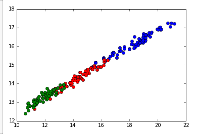
Finally, we can graph the classifications of the data points by the first two features. There are seven features total, but it would be hard to visualize. You can graph by other features for similar visualizations.
# Plot first two features (area vs perimter in this case)
plt.plot(data[cls==0,0], data[cls==0,6],'ob',
        data[cls==1,0], data[cls==1,6],'or',
        data[cls==2,0], data[cls==2,6],'og')
plt.show()
Note: to show the plot inline in the cell, we put ‘%matplotlib inline’ at the beginning of the cell.
Leave a Reply