Stocks with Outperform Ratings Beat the Market
Introduction
I recently began investing and was wondering how good analysts are at predicting the future of a company. So here is a short data analysis of my curiosity!
In short, we will be answering these hypotheses:
- Price targets can accurately reflect the future price of a company.
- Some analysts can predict better than others.
- A “buy” or “outperform” rating will on average predict a stock moving up.
- Some analyst ratings are better than others.
- If we were to invest only in stocks with “buy”/”outperform” ratings, we can beat the market.
A price target is the price a financial analyst believes that a stock will reach in a year.
A performance rating is the rating a financial analyst assigns a stock that comes from their combined research and analysis of the company.
Methodology
Since my investments are mostly in Canada, I will be focusing on Canadian equities. To reduce the amount of noise, I looked at companies with the following conditions:
- Listed on the TSX
- Market cap over $1 billion
- Stock price over $5
The source data for companies can be found here: http://www.theupside.ca/list-tsx-stocks-market-capitalization/.
All source code can be found here: http://github.com/ayoungprogrammer/price-targets
Next, to get the price targets and performance ratings, I used Marketbeat and for stock price information, I used the “unofficial” Yahoo Finance api. One restriction is that Marketbeat only had ratings for the last 2 years but it should be enough data to look back at enough ratings.
For each analyst rating assignment, I looked at the 10 day average centered around when it was assigned and the 10 days average centered around a year in time.
After some webscraping and html/json parsing we have the dataframe with sample rows:
| ticker | analyst | target | rating | aver_close_at_analysis | analysis_date | aver_close_at_12m | 12m_date | |
|---|---|---|---|---|---|---|---|---|
| 0 | RY | TD Securities | 78.00 | Hold | 70.282856 | 2016-03-02 | 97.832857 | 2017-03-02 |
| 1 | RY | Scotiabank | 77.00 | Outperform | 70.282856 | 2016-03-02 | 97.832857 | 2017-03-02 |
| 2 | RY | TD Securities | 80.00 | Buy | 69.029999 | 2016-02-25 | 97.656251 | 2017-02-25 |
Each row corresponds to a rating issued by an analyst with the following attributes:
- ticker: Ticker symbol
- analyst: Analyst who rated
- target: Target price issued by analyst
- rating: Rating issued by analyst
- aver_close_at_analysis: 10 days average stock price centered on analysis date
- analysis_date: When the analysis was issued
- aver_close_at_12m: 10 days average stock price centered 12 months from analysis date
- 12m_date: 1 year from the analysis date
Results
We can calculate the error between the target price and actual price as follows:
Let
\( t = \) target price,
\(p_0 = \) price at analysis,
\(p_1 = \) price at 12 years after analysis
\(error = 100 \times \frac{t – p_0}{p_0} – \frac{p_1 – p_0}{p_0} \)Intuitively, this is difference in percentage change from the prediction and the actual. For example, error = 5 means the target price was 5% higher than then actual percentage change.
In code:
df['target_perc'] = (df['target'] - df['aver_close_at_analysis'])/df['aver_close_at_analysis'] * 100
df['real_perc'] = (df['aver_close_at_12m'] - df['aver_close_at_analysis'])/df['aver_close_at_analysis'] * 100
df['error'] = (df['target_perc']-df['real_perc'])
df['abs_error'] = abs(df['error'])
| ticker | analyst | target | aver_close_at_12m | target_perc | real_perc | error | |
|---|---|---|---|---|---|---|---|
| 0 | RY | TD Securities | 78.00 | 97.832857 | 10.980122 | 39.198750 | -28.218627 |
| 1 | RY | Scotiabank | 77.00 | 97.832857 | 9.557300 | 39.198750 | -29.641449 |
| 2 | RY | TD Securities | 80.00 | 97.656251 | 15.891643 | 41.469292 | -25.577649 |
A quick glance at the data shows that some of the ratings have very high variance. Therefore, we should try to reduce the noise of our error measurement by getting rid of some outliers. We will do so by removing outliers in the 10th and 90th percentiles. We also remove analysts with less than 100 ratings, so we can compare the most important analysts.
With pandas, we can easily group the data by analyst and aggregate attributes with different functions:
def filter_tail(data, p1=10, p2=90):
    q1 = np.percentile(data, p1)
    q3 = np.percentile(data, p2)
    return data[(data > q1) & (data < q3)]

analysts = df.groupby(['analyst'], as_index=False)['error'].agg({
        'mean_abs_err': lambda xs:np.mean(np.abs(filter_tail(xs))),
        'count': 'count',
        '10p': lambda xs: np.percentile(xs, q=10),
        '90p': lambda xs: np.percentile(xs, q=90),
        'mean': lambda xs: np.mean(filter_tail(xs)),
        'std': lambda xs: np.std(filter_tail(xs)),
    })
analysts = analysts[analysts['count'] > 100].sort_values(by='mean_no_outliers')
| analyst | std | mean | mean_abs_err | 10p | 90p | count | |
|---|---|---|---|---|---|---|---|
| 48 | National Bank Financial | 16.365463 | -2.532164 | 13.425469 | -40.092491 | 30.074729 | 251 |
| 3 | BMO Capital Markets | 18.982738 | -2.282366 | 14.435614 | -55.866637 | 35.678834 | 248 |
| 7 | Barclays PLC | 16.120963 | -0.586090 | 13.128664 | -35.657920 | 37.853971 | 212 |
| 20 | Desjardins | 18.972093 | -0.542214 | 15.355082 | -49.563907 | 33.312509 | 115 |
| 12 | Canaccord Genuity | 18.101054 | 4.703447 | 14.967193 | -35.795798 | 47.363220 | 302 |
| 10 | CIBC | 19.098723 | 4.960119 | 15.799013 | -31.113204 | 48.409297 | 446 |
| 58 | Royal Bank of Canada | 18.198846 | 5.544864 | 15.402881 | -34.362247 | 50.268754 | 584 |
| 66 | TD Securities | 20.179027 | 5.868849 | 17.002451 | -44.254427 | 47.655748 | 551 |
| 54 | Raymond James Financial, Inc. | 21.500147 | 7.580748 | 18.711069 | -42.025280 | 51.284896 | 269 |
| 62 | Scotiabank | 18.735960 | 7.741048 | 15.962621 | -32.351408 | 53.038985 | 706 |
We can also plot the means and standard deviations as error plots:
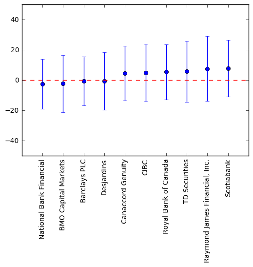
From the aggregate table, we see that Barclays PLC has the least mean absolute error, i.e., its error is closest to 0 and is the most accurate. Barclays PLC also has the “tightest” standard deviation, so it is also the most precise. However, we see that the standard deviations for each analyst is very large; so the precision of each analyst is very low. Barclays PLC has a standard deviation of 16% which we can interpret as 95% of price targets will be +/- 32% off. For example, if TD Bank current stock price is $100 and Barclays PLC gives a price target for $100, all we can reasonably expect is the stock price to range from ~$70 to ~$130.
Thus we can answer our first two hypotheses:
- Analysts are on average, accurate in their predictions with their mean error close to 0. However, price targets cannot precisely predict the future of a company in 12 months.
- According to the data, Barclays PLC has the most accurate and precise price targets, but only by a small margin.
A more intuitive image of precision vs accuracy: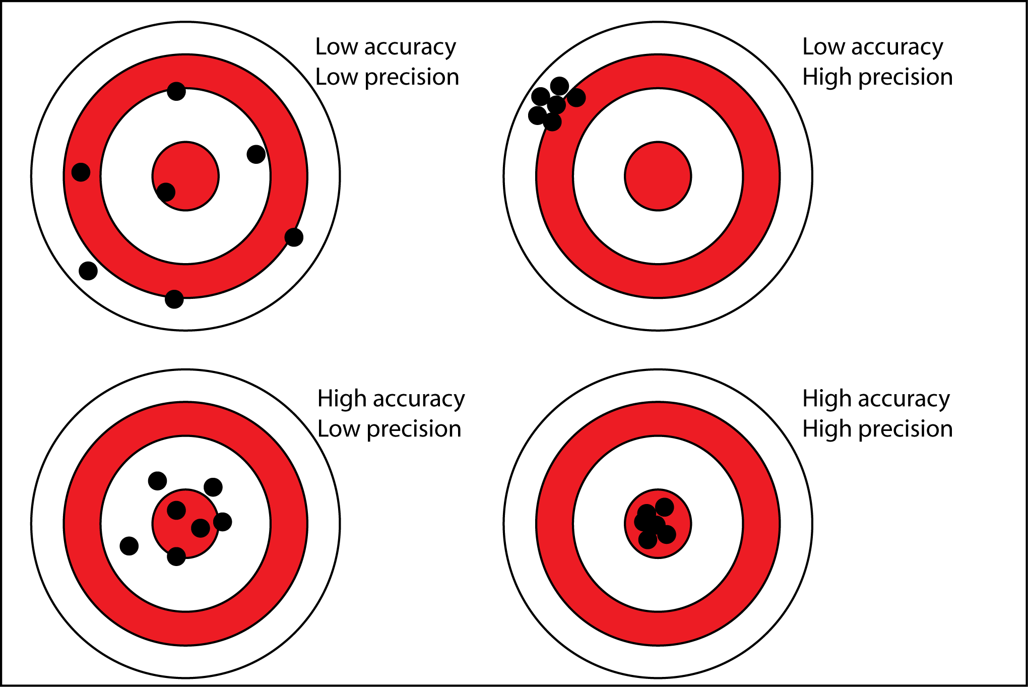
Next, we will look at analyst ratings and explore their relation to stock performance.
Using pandas again, we can easily filter out price targets with no rating and only take the ratings from analysts that care about (in the previous table). We can also easily group by each analyst and rating and aggregate with different functions on different attribute.
ratings = df[(df['rating'] != 'NaN') & (df['analyst'].isin(analysts['analyst']))]
ratings_agg = ratings.groupby(['analyst', 'rating'], as_index=False).agg({
        'error': {
            'mae': lambda xs: np.mean(np.abs(filter_tail(xs))),
        },
        'real_perc': {
            'mean': 'mean',
            'median': 'median',
            '10p': lambda xs: np.percentile(xs, 10),
            '90p': lambda xs: np.percentile(xs, 90),
            'count': 'count',
        },
        'target_perc': {
            'median': 'median',
            '10p': lambda xs: np.percentile(xs, 10),
            '90p': lambda xs: np.percentile(xs, 90),
        }
    })

ratings_agg.columns = list(map('_'.join, ratings_agg.columns.values))
ratings_agg[ratings_agg['real_perc_count'] > 10]
Attributes:
- target_perc_10p: 10th percentile for price target change percentage
- target_perc_90p: 90th percentile for price target change percentage
- tarc_perc_median: median for perice target change percentage
- error_mae: mean absolute error
- real_perc_10p: 10th percentile for real price change percentage
- real_perc_90p: 90th percentile for real price change percentage
- real_perc_median: median for real price change percentage
- real_perc_count: number of ratings
- real_perc_mean: mean of real price change percentage
Sample rows:
| analyst_ | rating_ | target_perc_10p | target_perc_90p | target_perc_median | error_mae | real_perc_10p | real_perc_count | real_perc_mean | real_perc_90p | real_perc_median | |
|---|---|---|---|---|---|---|---|---|---|---|---|
| 0 | BMO Capital Markets | Market Perform | -0.249542 | 23.049416 | 7.826429 | 17.048387 | -13.624028 | 82 | 29.306269 | 86.571109 | 11.962594 |
| 2 | BMO Capital Markets | Outperform | 9.333289 | 34.091310 | 18.863216 | 13.267287 | -13.430220 | 116 | 22.215401 | 64.711223 | 15.109094 |
| 5 | Barclays PLC | Equal Weight | -5.964636 | 10.834989 | 4.672844 | 11.317883 | -23.540832 | 72 | 11.511754 | 37.461244 | 9.239600 |
Now we take only analyst ratings with at least 20 and then sort by stock performance (change in stock price over a year). We can take the top 10 and perform more analysis on those.
top_ratings = ratings_agg[ratings_agg['real_perc_count'] > 20]
top_ratings = top_ratings.sort_values('real_perc_mean', ascending=False)
top_ratings['analyst_rating'] = top_ratings['analyst_'] + ' ' + top_ratings['rating_']
top_analyst_ratings = top_ratings['analyst_rating'].head(10)
top_analyst_ratings
Sorted by real price change percentage:
| analyst_ | rating_ | target_perc_10p | target_perc_90p | target_perc_median | error_mae | real_perc_10p | real_perc_count | real_perc_mean | real_perc_90p | real_perc_median | analyst_rating | |
|---|---|---|---|---|---|---|---|---|---|---|---|---|
| 32 | National Bank Financial | Sector Perform | 0.277827 | 45.337101 | 8.695651 | 14.170428 | -5.738096 | 81 | 29.887596 | 61.182293 | 17.410111 | National Bank Financial Sector Perform |
| 0 | BMO Capital Markets | Market Perform | -0.249542 | 23.049416 | 7.826429 | 17.048387 | -13.624028 | 82 | 29.306269 | 86.571109 | 11.962594 | BMO Capital Markets Market Perform |
| 54 | TD Securities | Action List Buy | 18.333724 | 77.701954 | 38.001830 | 19.629657 | -0.893705 | 36 | 28.334038 | 71.459495 | 15.928740 | TD Securities Action List Buy |
| 21 | Canaccord Genuity | Buy | 8.340735 | 61.226203 | 24.085974 | 18.796959 | -16.561733 | 177 | 27.086690 | 86.234464 | 18.039215 | Canaccord Genuity Buy |
| 31 | National Bank Financial | Outperform | 7.705539 | 53.579343 | 18.929633 | 12.407454 | -1.526925 | 115 | 24.524428 | 59.093628 | 22.213398 | National Bank Financial Outperform |
| 2 | BMO Capital Markets | Outperform | 9.333289 | 34.091310 | 18.863216 | 13.267287 | -13.430220 | 116 | 22.215401 | 64.711223 | 15.109094 | BMO Capital Markets Outperform |
| 14 | CIBC | Sector Outperformer | 9.714648 | 59.846481 | 33.652243 | 21.688542 | -14.518562 | 44 | 22.205022 | 60.020932 | 22.218981 | CIBC Sector Outperformer |
| 43 | Royal Bank of Canada | Sector Perform | -0.678788 | 36.516168 | 11.101983 | 13.099112 | -11.590060 | 220 | 21.330160 | 51.282201 | 10.498096 | Royal Bank of Canada Sector Perform |
| 36 | Raymond James Financial, Inc. | Outperform | 9.437804 | 54.483693 | 21.236522 | 15.914385 | -18.695776 | 106 | 20.773835 | 59.159844 | 13.004491 | Raymond James Financial, Inc. Outperform |
| 49 | Scotiabank | Outperform | 7.239955 | 50.402485 | 19.082141 | 15.926344 | -21.632875 | 246 | 18.407885 | 51.023159 | 14.897374 | Scotiabank Outperform |
We can make an error plot for the mean and standard deviation of the real percentage change for each analyst rating:
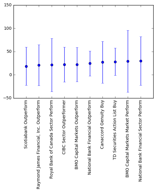
We can see that stocks with the top analyst ratings go up on average 25% in a year which is very good. Based on the error plot, TD Security Action List Buy seems to perform the best in terms of high mean and lower variance. Although there is high variance, the mean is more meaningful in this case. If we were to invest $1000 in each of the stocks when were given the rating, we would make about $1250 on average after a year, which is what we really care about. The TSX index went up 11% and TSX index annualized return is 9.1%. So we’re actually beating the market by ~16% with this strategy!
However, keep in mind that this data is for the last 2 years and is not indicative of future performance. On the other hand, I believe this strategy could make sense since analysts put significant effort and research into their rating and also because of the influence of the rating. People probably trust the analysts and would likely invest knowing that the stock has a good rating thus self fulfilling the rating.
With this analysis, we can conclude our last 3 hypotheses:
- A buy or outperform rating will on average go up on average by 15-20%.
-
TD Security Action List Buy appears to be the strongest indicator for a stock to perform well.
-
If we buy stocks with the top 10 ratings when they get issued and sell in exactly one year, we will beat the market by ~16%.
Conclusion
- Price targets aren’t a good indicator of where the price of a stock will go.
- The top performance ratings are a good indicator for a stock performing well.
- You could possibly beat the market by only buying stocks with sector outperforms or buy ratings and selling in one year.
Please keep in mind that I am by no means a financial expert and am not certified to give financial advice.
All the code can be found here: https://www.github.com/ayoungprogrammer/price-targets